

A few months ago, I was browsing The Yafa Brand Pen Society Facebook page and I came across a photo of this pen. Yafa was running a contest at the time and this pen was the prize. Right then, my first thought was that this pen had a sleek, simple, modern design, without all the extra showiness typical on many pens today. On their website, Monteverde describes this pen as “inspired by the minimalist movement of the 1960’s and 70’s, where clean lines, straightforward designs and beautiful colors within work were the most prominent.” Right away, that drew me in so I went ahead and entered the contest. Fast forward to today, I have been enjoying this Ritma that I was lucky enough to win from that contest.
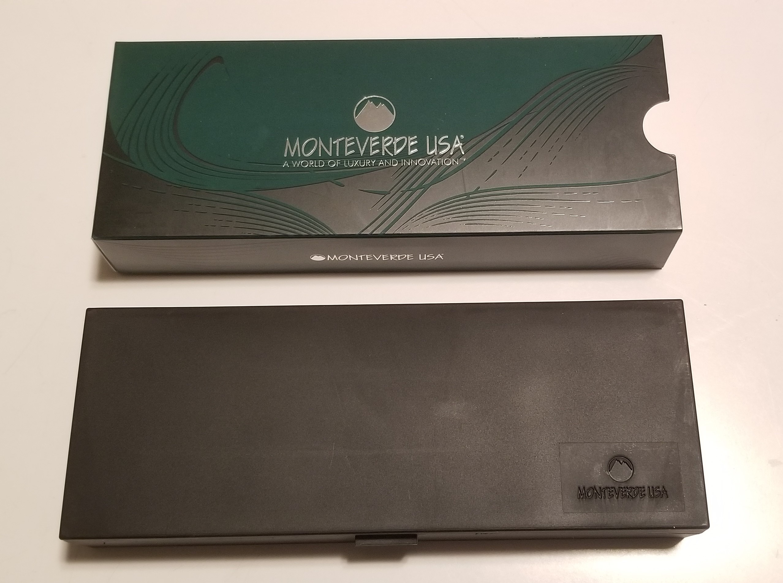

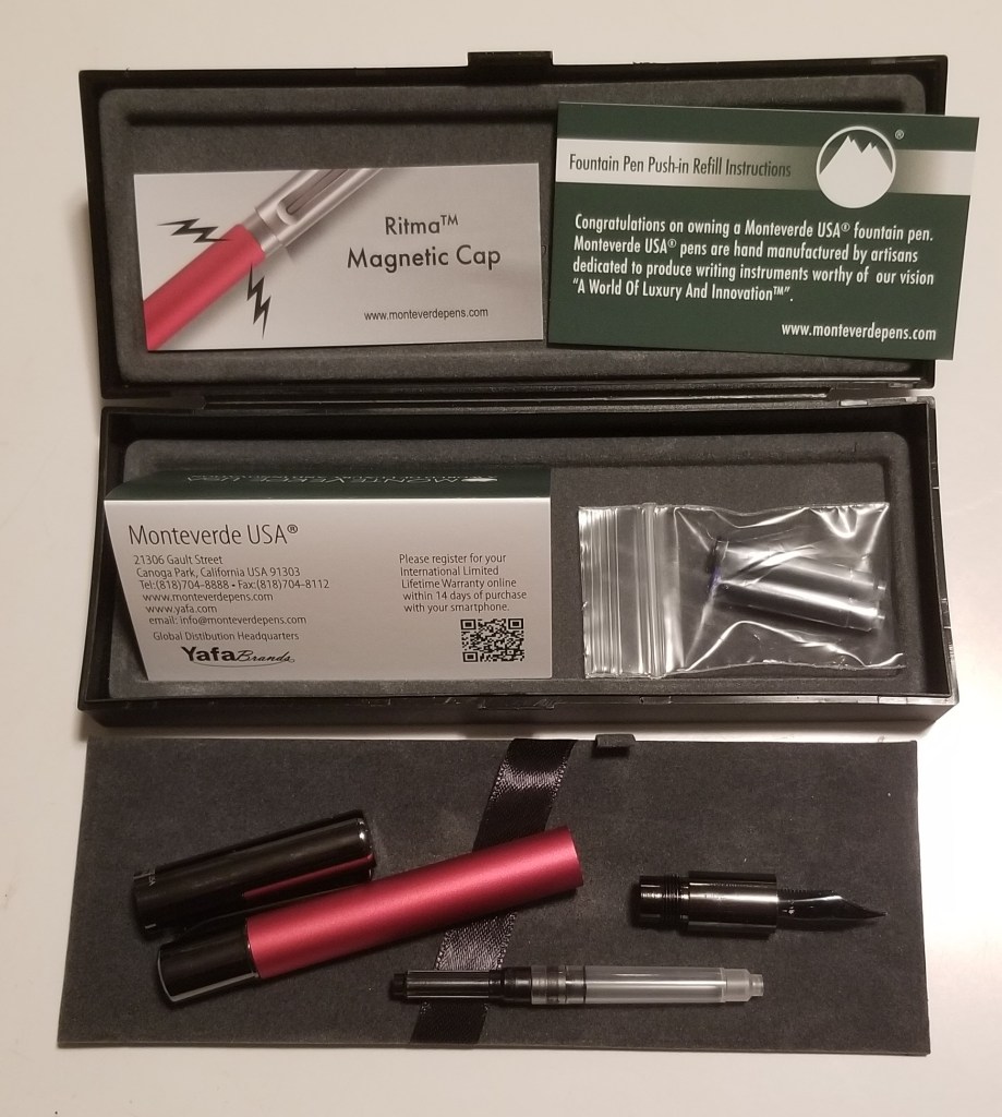
The pen came packaged differently than my other Monteverde pens. It came in a plastic case inside of an outer sleeve which has a beautiful yet subtle design printed on it. Much like the pen, the packaging is simple and not overly fussy. Inside the box, clipped to the pen itself, was a card with information about the magnetic cap. Under the removable tray, is a card with instructions on how to refill the pen using the included cartridges, one blue and one black, or the converter which was inside of the pen. There is also a card explaining the international limited lifetime warranty and a link to register your pen.
While I knew from my first sighting of the pen a few months back that I liked the style of the pen, what I didn’t know until holding it in my hands was how substantial the pen would feel. At 32.8g (1.16oz), this pen is a comfortable weight for me, I like a lot of pens that have some heft to them. The pen also fits well in my hand un-posted at 128.5mm (5.06in). I personally do not normally post my pens, I prefer when the end of the pen is just a bit above my hand so for me, at 159.5mm (6.28in) and 48.9g (1.72oz) posted, it is just a bit long and just a bit too heavy for me to be comfortable with. For someone with larger hands though, posting the pen would be comfortable as the cap seamlessly fits with the body of the pen.
Speaking of posting, one of my favorite features about this pen is the magnetic cap. The cap seals very well, so much so that it makes a satisfying popping sound as you pull the cap off from just the change in air pressure. It then makes a nice firm click as the magnet secures the cap to the pen body at both the section to close the pen, and the back to post the pen. It is really nice to never have to worry about the seal wearing out or the cap getting loose over time. I would love to see more pens with this type of cap in the future.
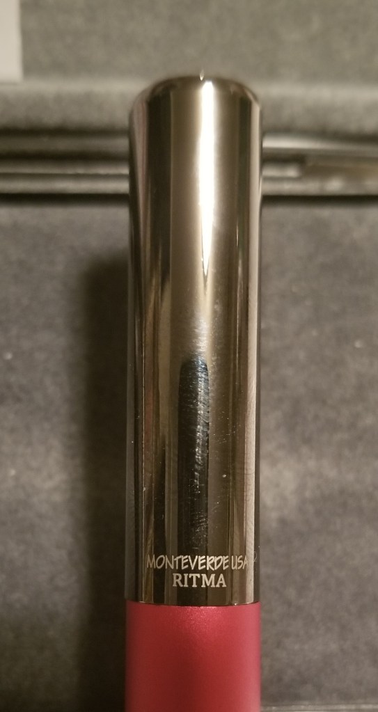
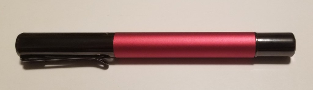
The design of the cap is also very simple with just a few precise details. The top of the cap is slightly concave and on the side of the cap it is etched “Monteverde USA Ritma” The clip is a simple and functional design but is very tight to the body, of the pen. You may need a second hand to hold your shirt pocket when using the clip.

I really love the Anodized aluminum gunmetal finish that Monteverde chose for the trim and cap of the pen. The matte finish barrel looks nice in contrast to the shine of the metal and gives a nice feel in the hand. I do wonder if the Matte finish will wear smooth with use over a few years but only time will tell.
I inked this pen up with Monteverde Midnight Black ink using the included converter. One concern I had while filling was that the end of the section where the converter connects is shallow. While the converter does tightly seat onto the nib unit, the converter does have some side to side movement possible as the sides are not supported inside of the section. In practice however, this never became an issue during use of the pen. The converter never came loose on me even though I gave it a bit rougher treatment than I usually would give my pens.

The nib on this pen is made by Jowo for Monteverde and has a blackened finish to it. I chose the fine nib for myself which usually fits my handwriting well. I found the nib to be what I would expect from Jowo. The pen wrote smoothly with no hard starts or skipping. The ink flow was consistent with what I would expect from using one of my regular Monteverde inks and the pen overall performed just as it should. I do tend to hold my pens fairly far forward close to the nib so for me personally I would have liked the section to be just a couple of millimetres longer. That would have had my finger fully on the section rather than touching the barrel while writing. This did not cause any issues for me in using the pen and it was not uncomfortable by any means, but a slightly longer section would have fit my hand a bit better. What I did like was that the section was fairly straight without the taper or indent that many pens have. I like a bit of a chunky grip on a pen. Because of the way it was designed, even though it has a smooth metal section, my fingers did not feel like they were slipping down on the grip.
Overall, despite the concerns I had with the fit of the converter and the length of the section, I am happy with this pen. The section length may be more of an issue for someone with very large hands, but for me it was still okay and the fit of the converter never became an issue for me. I love the minimalist style of the pen, understated but elegant and it writes well. For the money it is an excellent value.

If you like the simple straight forward styling of this pen, I would definitely recommend picking one up. The MSRP is currently $45.00 USD for the fountain pen, however at the time of this writing, at most retailers, it is readily available for $36.00 USD. It currently comes in 4 colors: red, blue, black, and silver. The pen is available in nib sizes: EF, F, M, B, and 1.1 stub. There is also a ballpoint option in the same colors.


I just came across this writing tool, and simple straight forward lines design attracted me to it, also the fact that carries a Jowo nib made in Germany…
I ordered a black finish with an EF nib can hardly wait to try it.
LikeLike